A Responsive Case Study
Responsive design, mobile first design, device agnostic design - whatever you choose for terminology it’s a fact your design is going to be seen on devices you’re aware of and a few you’re not. Over the last few years many very smart people have come up with some best practices. However, the real world is a messy place - sometimes you have to do what you must and not necessarily what you’d like to do in order to solve a problem. This is a look at our ongoing approach to this problem and the challenges and concessions we’ve had to make.
In the beginning
Flash back to a little over 2 years ago here at Reviewed.com. The site had been around for over 10 years in one form or another already. We had just redesigned the front end.
Houston, we have a problem
However, for a site that reviewed dozens of gadgets we were only built for one at the time - the desktop. We didn’t have a lot of resources. We were well aware of best practices like mobile first design but another complete redesign from the ground up to do this just wasn’t feasible.
So like many companies, we had to work backwards - taking our desktop app and solid use of things like media queries and established patterns in order to meet our goal. We were aware of some of the concessions and challenges we’d encounter, but some didn’t come up right away and some are still bubbling up to this day as new devices are released, like smart watches, and new considerations are raised to the forefront, like performance concerns.
Challenges
Devices
One of the first challenges we faced was not having a device lab. Luckily there are many tools to help simulate one. Things like iOS Simulator and device mode in Chrome allow you to have a ‘virtual’ device lab. You can see your how your design performs at numerous resolutions and even emulated bandwidth.
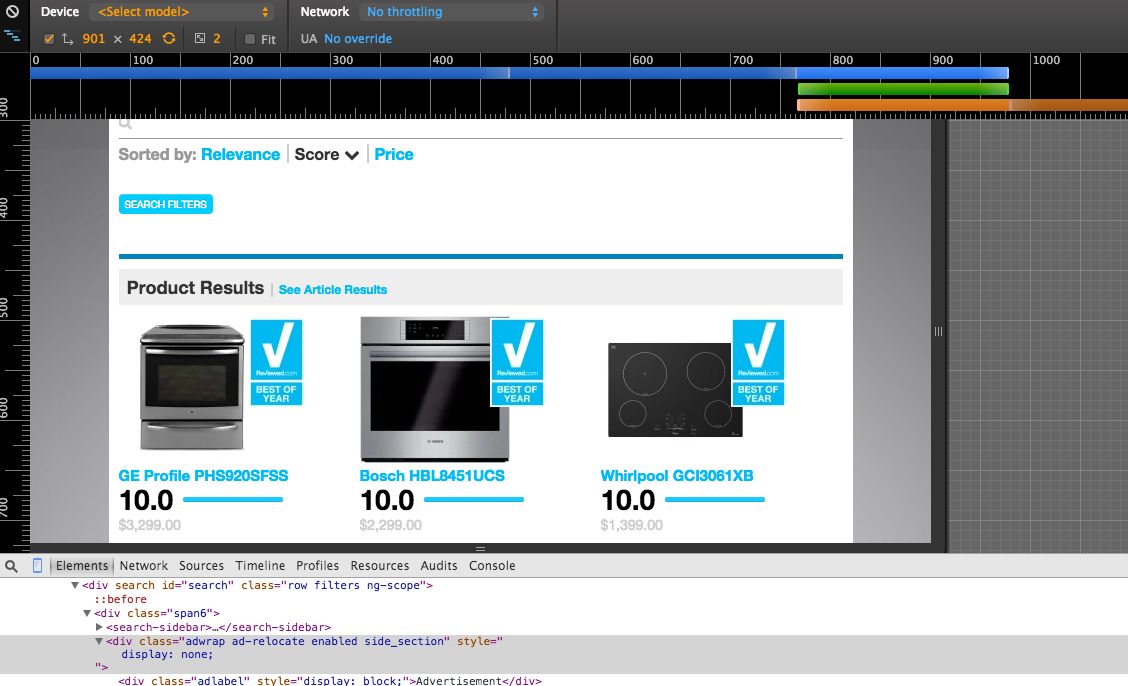
However, you’re still viewing your design on a large screen via emulation so you can be blinded to things like touch patterns or the thumb zone. But like anything with design you iterate - solving the big problems first and gradually moving down to the smaller ones.
Search heavy application
While we are very mindful of building good navigation via browsing our common user is someone who is trying to narrow down what product to buy from a list of similar products (oven, laptop, refrigerator, etc). So most of our user navigation is done via search and we spend a great deal of resources on trying to improve our search functionality and make it as intuitive as possible.
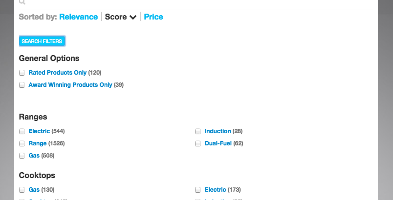
Like Amazon, we use a very filter heavy search approach so we had to be mindful of transitions and how those would affect how we present filters. There are many solutions to this problem and we’ll likely iterate on it in the future but being mindful of gotchas like this will definitely help to make your design more intuitive than simply stacking the layout at breakpoints.
Filters closed

Filters open
Concessions
You can’t solve all the problems at once
Responsive design is simple in concept but can be very complex in execution depending on your application. Every time we (think we) solve one problem a new one arises or takes precedence. You can’t simply just design to be device agnostic - especially since new devices (like smart watches, consoles) present new patterns and challenges.
For example, one challenge we discuss but haven’t solved yet is centered around bandwidth. How does our site perform for phones on a 3G network? Should we simplify our design - removing elements, JS frameworks, CSS and just page weight in general - to streamline our responsive approach? Or do we split our application and make a mobile only site that doesn’t have to make concessions to other break points? There’s pros and cons to both.
Still, the point is to continue to solve problems iteratively so that your design is progressing forward - not to get it all correct from the start.
New features are always being added
Few sites are static. For example, in the last two years we’ve added a video page, events, and awards pages. With each new feature we have to ask:
- How does this fit into the navigation?
- What patterns can we reuse at the various breakpoints?
- What new patterns arise from this feature?
Solving these new problems brings up new questions about and iterations on old solutions as we think about the problem a different way or from a different perspective. These are opportunities to reassess your approach.
What would we have done differently?
So if we had a time machine and could go back 2 years would we change all of the things? Probably not. There are certainly some things we try to / will be mindful of in order to make it easier going forward:
- Design new features mobile first - if you can’t do it right from the start, do it right going forward
- Test on a lot of devices - we’re lucky in that our editorial staff views the site a lot on a wide spectrum of devices and gives us feedback
- Be more cognizant of touch capabilities and patterns - there are a lot of touch events that can be used to do some cool / slick things. As these become more intuitive to users it opens up potentially more avenues on touch capable devices than on mouse driven devices
- Be more mindful of patterns for and testing on tablet - phone and desktop seem to get the most attention with us and in the articles we read but tablet presents some interesting challenges and opportunities. Ownership of tablet devices is also growing compared to traditional desktop devices
- Bring more people in to challenge ideas and constructively criticize - luckily, we have many intelligent and interested editorial members that offer feedback. We need to continue not only to welcome that but foster it earlier in the process
Conclusion
Our goal with this was simply to present some of the challenges we faced and concessions we made in moving and iterating on a responsive design. Many of the articles we saw spoke of best practices and great examples. Sometimes you can’t follow the direct path though - the real world is rarely ideal. It isn’t always mobile first development with rock solid usable multi-device patterns tested on a suite of devices. Sometimes it’s messy - and that’s ok.
Remember that the goal is make your content as readable as possible in a design that’s as intuitive as possible on as many devices as possible for your specific situation. It’s also to keep iterating to improve your solution as you go forward.
Automate All the Things With Hubot
Written by Luke Bergen
Deployment, tooling, workflow… in a word: “process”. These things suck and take time away from what you really enjoy doing, like writing code.
But have no fear, with Hubot, you can do more of the stuff you love while Hubot deals with all the annoying automated things that computers are good at.

In case you haven't heard of it, hubot is a chat bot written by Github. It’s fairly simple to install, there are a ton of community developed scripts, and it has adapters for just about any chat service you can think of.
Now, while adding a robot to your chat room that you can command to fetch funny images from the Internet is cool, it also allows for some incredibly powerful tools and workflow optimizations.
Expanding Hubot's capabilities is a simple matter of adding a new coffee file to your repo and then telling the robot object what to do when it hears a particular regex pattern. Here's a simple example.
1 module.exports = (robot) ->
2   robot.respond /(sudo)(.*)/i, (msg) ->
3     msg.send "Alright. I'll #{msg.match?[2] || 'do whatever it is you wanted.'}"
As I said earlier, this can lead to some fun little scripts between you and your teammates. But consider what you can do when you get restful services and npm modules into the mix. For example, we use a pull request based workflow here at reviewed.com. So being able to convert a branch/pull request into a running version of our app for stakeholders to verify is a critical piece of our workflow.
With hubot's ability to interact with http endpoints and Heroku's excellent API all we need to do to get a new fork of our production app is to say “hubot fork app_name identifier” and BAM. Our helpful little robot comes back with “Luke Bergen: New app_name staging fork available at https://app_name-identifier.herokuapp.com/!!! Git URL is git@heroku.com:app_name-identifier.git”
I've edited out some of the details that are specific to our team. But the important parts of our fork script look like this.
First, some meta-data that hubot uses to inform users who ask things like “hubot help” or “hubot help fork”.
 1 # Description:
 2 #   Spin up a new fork with a unique identifier from one of our apps
 3 #
 4 # Dependencies:
 5 #   heroku-client
 6 #
 7 # Configuration:
 8 #   HEROKU_API_KEY environment variable
 9 #
10 # Commands:
11 #   hubot fork <app name> <identifier> - create a fork
12 #
13 # Author:
14 #   Tim Raymond and Luke Bergen
Next, we set up the Heroku client with our Heroku API key.
1 Heroku = require 'heroku-client'
2 heroku = new Heroku({token: process.env.HEROKU_API_KEY})
Now we're going to tell the robot what to listen for and set some variables based off of the key pieces of the message. We're also going to grab the current user based off of who it was that invoked hubot's mighty strength.
1 module.exports = (robot) ->
2   robot.respond /fork\s([\w-]+)\s([\w\d-]+)/i, (msg) ->
3     app = msg.match[1]
4     forkname = msg.match[2]
5
6     currentUser = ""
7     for own key, user of robot.brain.data.users
8       if msg.envelope.user.id == user.id
9         currentUser = user
Now here's where the good stuff happens.
1 heroku.apps().create {name: "#{app}-#{forkname}"}, (err, new_app) ->
2       heroku.apps(app).configVars().info (err, vars) ->
3         fork.configVars().update(vars)
4         fork.features("user-env-compile").update()
5         if currentUser.heroku_email
6           fork.collaborators().create({user: currentUser.heroku_email})
7         else
8           msg.reply "I don't have your Heroku login, so I can't add you as a collaborator to your new fork"
This piece was a little heavy so let's deconstruct it a bit. First, we’re calling into the Heroku module's apps().create function. This function takes a hash with information about the app (we're just passing the name) and a callback function. The callback function takes an error object and an object representing the new app. For simplicity I'm not showing any of our error handling here. This callback function only gets executed once Heroku has either come back with an error or has successfully created the app.
Next, we want to configure our app. All of our apps generally use ENV variables to configure behavior, so it would be nice if our new forked app had the same settings. heroku.apps(app).configVars().info is a function that calls out to Heroku asking for the config vars for our base app and takes a callback to handle the results.
Inside this callback, we take the variables from the base app and set them on the fork app on line 3. We also turn on the user-env-compile feature.
Finally, remember that currentUser that we set up earlier? This is where we make use of it. Through another hubot script we keep a link between all chat room users and their Heroku email addresses. Using this, we add the user who asked us to create the fork as a collaborator to the app so that they can push changes and administrate it as necessary (I'll include this script at the end in case you're interested). And in case the user hasn't specified a Heroku account, we simply reply with a warning message.
Finally, we notify the user that everything is done.
1 msg.reply "New #{app} staging fork available at #{new_app.web_url}!!! Git URL is #{git_url}"And that's it.
As a separate script, but as an explanation for where that currentUser variable came from, here is our Hubot script to help us keep track of the relationship between chat room users and Heroku logins:
1 robot.respond /my Heroku login is (.+)/i, (msg) ->
2     for own key, user of robot.brain.data.users
3       if msg.envelope.user.id == user.id
4         user.heroku_email = msg.match[1]
5         msg.reply "Okay, you are #{msg.match[1]} on Heroku"
And with hubot's brain being stored in redis your team will only need to “hubot my Heroku login is user@organization.com” once per user.
We have a number of other scripts and integrations that make our day to day tasks easier including Github, Pivotal Tracker, and Travis webhooks to automate our CI process. But for now, I hope you can draw some inspiration from our fork script to improve your workflows as well.